Quickly view performance attribution of ETF and benchmark.
This article was last reviewed and updated on 5/4/23
Our Performance Attribution analysis compares the performance of a selected ETF’s portfolio against its benchmark which is represented by an ETF that has been identified as the lowest cost ETF which mimics the chosen benchmark.
Attribution does this by grouping certain categories, such as sector or geography, to understand how those categories and the corresponding securities within the portfolio of the ETF (based on the rules of the underlying index that the ETF tracks) performed relative to the benchmark during a given time frame.
Our intent is for these groupings and corresponding analyses will be able to assist you in understanding how an ETF’s portfolio differs from its benchmark and how those securities within the portfolio performed.
Using the Tool
You can access the Performance Attribution tool on our homepage, or by clicking the Hamburger Icon drop-down list in the top left corner of the platform under Advanced Analysis Tools.
 Once you are inside the tool, select an input ETF that you would like to analyze from the Security Lookup. After the input selection, you will need to select a secondary benchmark ticker from the Benchmark Lookup.
You can adjust the starting and ending dates of the analysis in the date select controls in the top right corner of the tool. The default Start Date is the first month of the current year, and the default End Date is the prior full month from the time of the analysis.
 Once your securities and dates are selected, press the Apply button.

Exploring the Data & Analytics
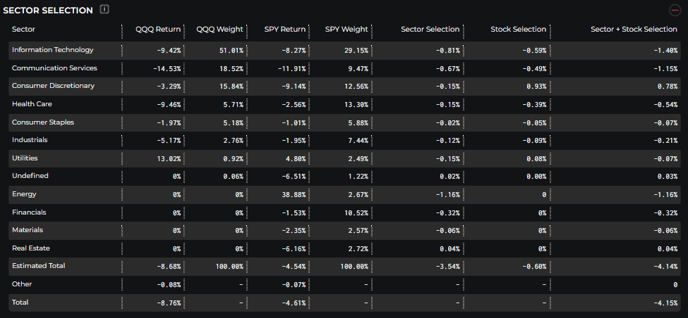
Sector Selection
- Sector Selection highlights return and weight by sector for the inputted ETF and the benchmark.
- The last 3 columns breakdown returns attributed to the sector weighting, stock selection, and a combination of both sector weighting and stock selection.

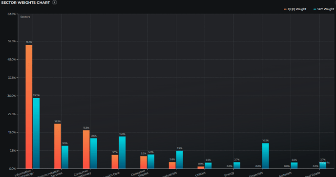
Sector Weights Chart
- This chart highlights the sector weight differentials between the selected ETF and the benchmark.

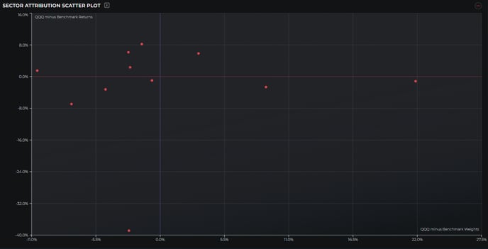
Sector Attribution Scatter Plot
- The Sector Attribution Scatter plot maps the outperformance of the ETF holdings by sector. Any points that are in the top 2 quadrants are indicative of outperformance versus the benchmark.
